Journey through the snow and be reborn.
Please download the game to play.
Click here: Red Rising
*Updates:
-text
-format
Journey through the snow and be reborn.
Please download the game to play.
Click here: Red Rising
*Updates:
-text
-format
Comments are closed.
– transition in-between passage is jarring–maybe put black background or CSS transition element
– can’t read some of the white text against the background (sections of the image are white)
– not sure if some parts are actually the ending
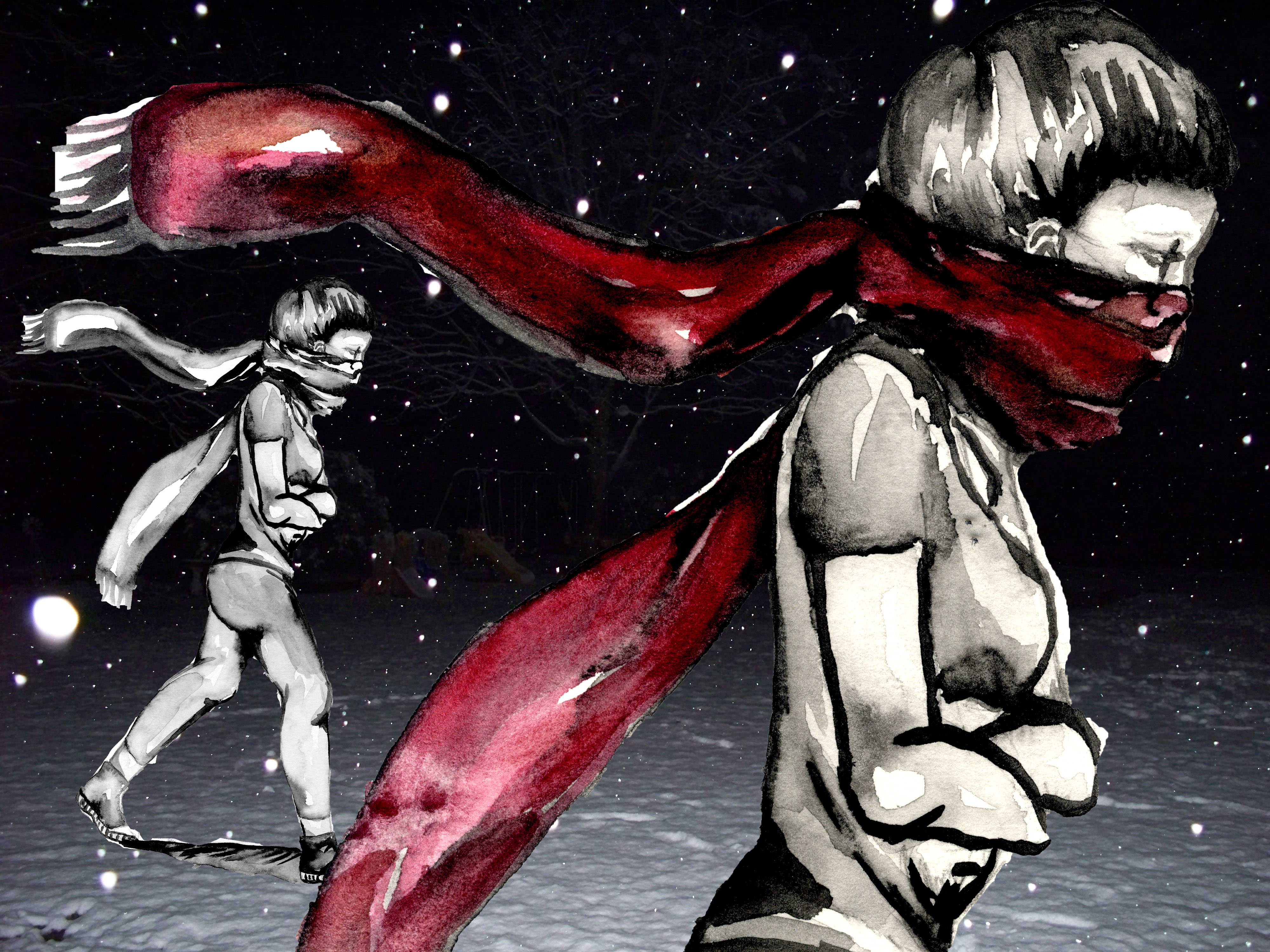
– cute
It’s a tad hard to read the white text against some of the background images. Sometimes I think this actually works: when only certain words from the sentence are blanked, it’s as if they too are blown away in the snow. That color symbolism is important though (the words associated with snow and white) so if that’s a layer to keep you may want to change the images for more clarity. The ending image didn’t emotionally resonate with me as well as the drawn images. It was a shift in tone that I didn’t expect (from fear and pain to the ending of It’s a Wonderful Life) and that didn’t work with me.
The styling issues are quite distracting.
There are a few things you can try: adding a shadow to the text will make it more readable
http://www.w3schools.com/css/css3_shadows.asp
Hiding the sidebar will make it look less cluttered
#sidebar { display: none; }
#passages { margin-left: 0; }
The default blueish color of the links doesn’t quite work. I’d recommend a red that is closer to the one you are using in the background.
The image of the snake metamorphosis should be terrifying but it’s kind of funny and out of place. It feels like the piece is a kind of joke and that’s the punchline.
It was interesting going for such a complex visual style but I feel like having so much focus being on the visuals detracted a bit from the choices being made. I was kind of confused since the ending I got. A photographic lizard? snake? head on top of the watercolor body randomly appeared and it seemed really jarring and didn’t really seem to fit the tone of the rest of the piece. If you were intending to make such a jarring effect happen, I feel like it needs to be pushed further in some way, since right now it seems to fall a bit flat. It also took a long time to load the story for some reason (due to the largeness of the image files? You might want to make sure that you’ve saved the files in correct formats, saved for web and whatnot), which detracts from its replayability.
I laughed when I got to the end. Cute!
I feel like this game could really use some macros to aid with its presentation. Look at the game Vacation Days that somebody else posted as an example for what to do; a lot of your links were words in the middle of sentences, and splitting the sentence in half across two different pages feels weird. Deliberately hiding half the sentence is a stylistic choice that can be used well, but if you can’t see both halves at once it’s a little jarring trying to parse the passages.
Not sure about the comments above. Perhaps you revised the issue before I played the game? Text is easily legible… Images above are beautifully rendered! Visual language
and text language work very well with the repetitive scratching and repetitive option to scratch. Can’t wait to see what you make when we move into games with a greater visual component.