
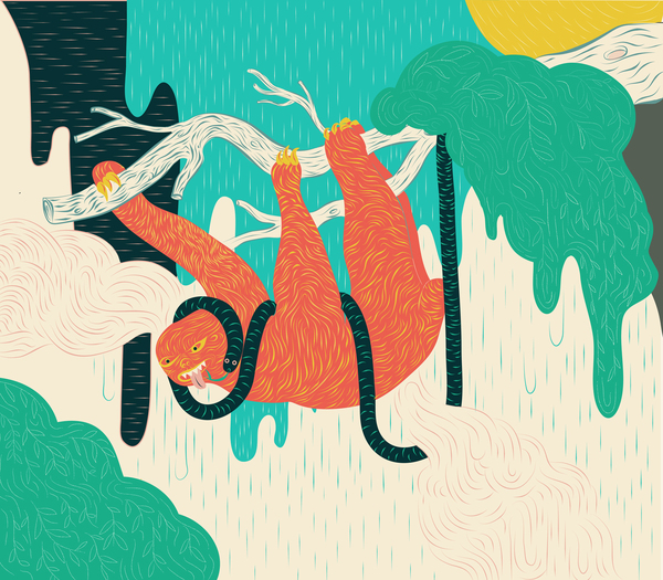
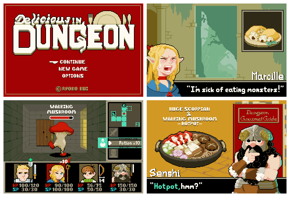
Let’s look at these independent 2D games.
They all “look good” even though they didn’t have dozens of people creating assets.
What are the distinctive visual elements?
What are the economic strategies in the production of assets?
How are the visuals related to the mechanics or theme?
Questions for you:
What’s your strategy for creating assets economically?
Simply “using 2D graphics” or “pixel art” is not an answer, 2D can require more effort than 3D
How does it relate to the theme and/or gameplay?
Considerations about mood and functional aspect (eg. we need to highlight interactive objects or separate foreground and background)
Does the visual style play to your team’s strengths?
JUST FOR A MOMENT let’s look at this project less as an artwork and more as a portfolio piece.
What is that you can do well, that you wish you could showcase, that you are considering as your specialization?
Are there ways to integrate this – without obviously hijacking the project or devolving into a design-by-committee process?
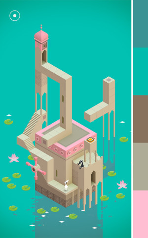
Colors
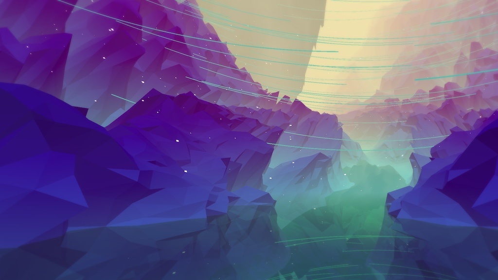
Most of the games above use a limited, non realistic, color palette.
Find a good color palette:
don’t pick colors at random
watch out for overtly saturated tones
try to limit your dominant colors.
Create a new based on common patterns with Kuler
You can steal color palettes from here
You can randomize a color scheme with this app
Create one from a picture with this tool
Fernando Ramallo picks colors from pictures of sunsets. Some other designer (I don’t remember who) confessed to rip off colors from vintage polly pocket toys.
Color ramps
Mostly used in pixel art but can it be applied in illustration and anywhere. Mind that there is no fixed system to create ramps and palettes, but it’s a good idea to familiarize with the practice of hue shifting:
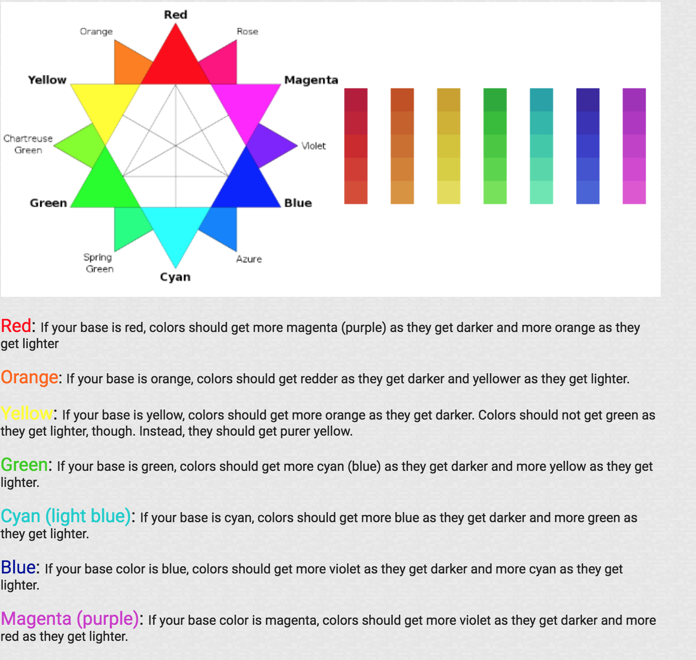
You can generate a color ramp one from a picture with this tool
Sometimes it makes sense to use a monochrome or analogous scheme…
The color scheme doesn’t have to stay the same!
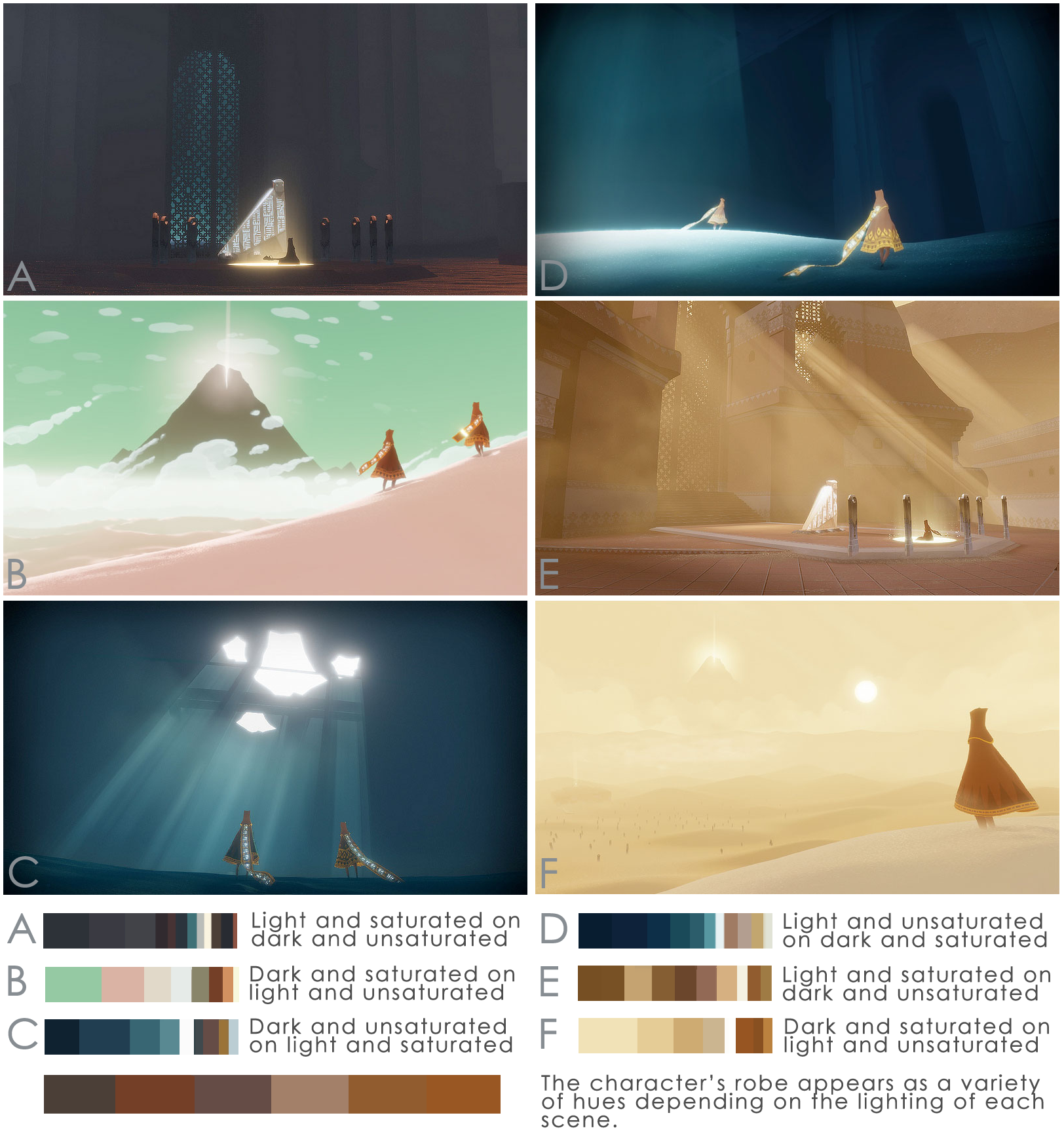
But more often than not you will need to differentiate between objects and create different ramps for your main colors.
There are plenty of tutorials and debates on the internet on how to properly create color ramps but it’s a common practice to make sure the ramps are interlocking, so you can have more harmonious edges or tinted outlines that work with different colors.
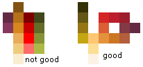
Figure out the dominant elements in your game. The scheme above may not work well for a story that takes place in the high seas.
If you follow these principle too closely you may end up with a boring palette, eg your object will look washed out in the same yellow or purple light. The use of bold complementary or non analogous colors, especially for accents.
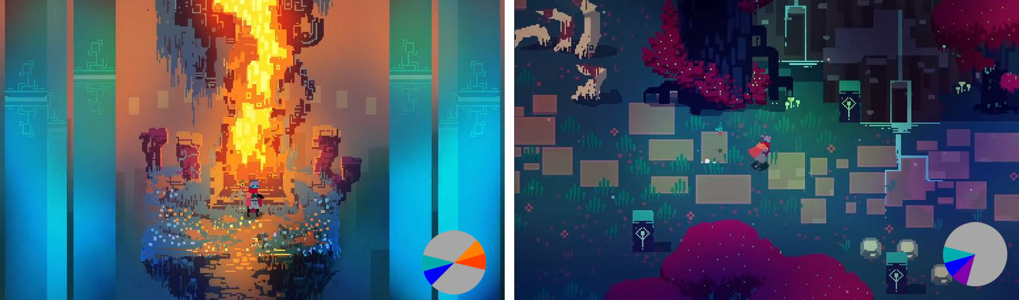
Hyper light drifter looks unique also because it doesn’t really seem to follow most of pixel art rules

Where do these colors and ideas come from? Once again NON-GAME INSPIRATIONS
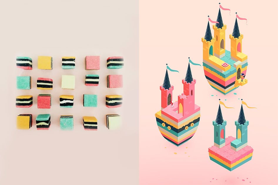
If you want to be a game artist, a graphic designer or an illustrator learn some color theory especially applied to the digital sphere.
For more complex/realistic illustrations like concept and background art it may make sense to paint in grayscale and colorize later.
Mood board
Themes and scenarios come with more obvious tropes attached. If you create a mood board by just googling keyword you’ll get only visual cliches.
You can try to subvert some of the expectations, create your own twist and interpretations to a particular setting.
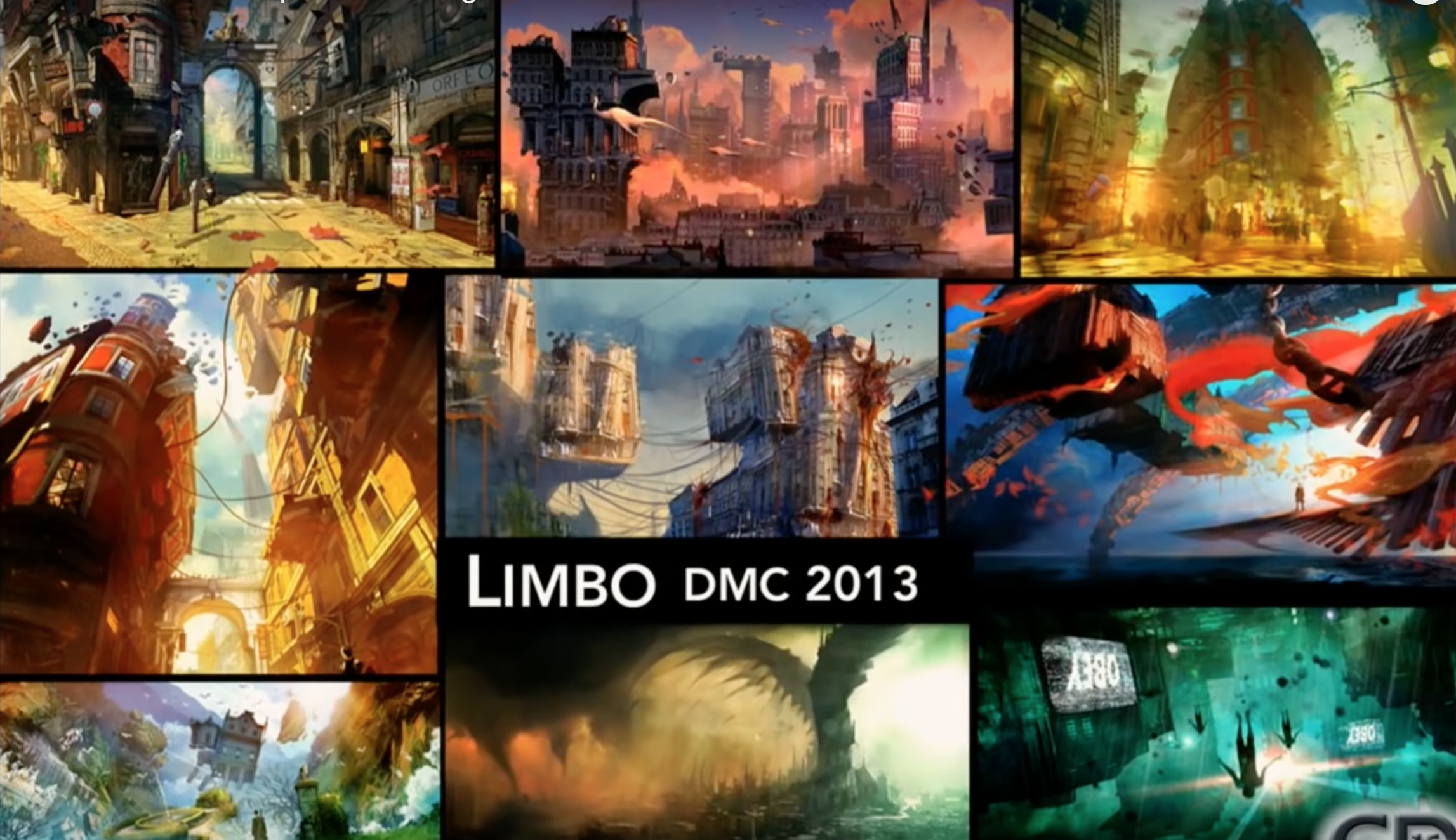
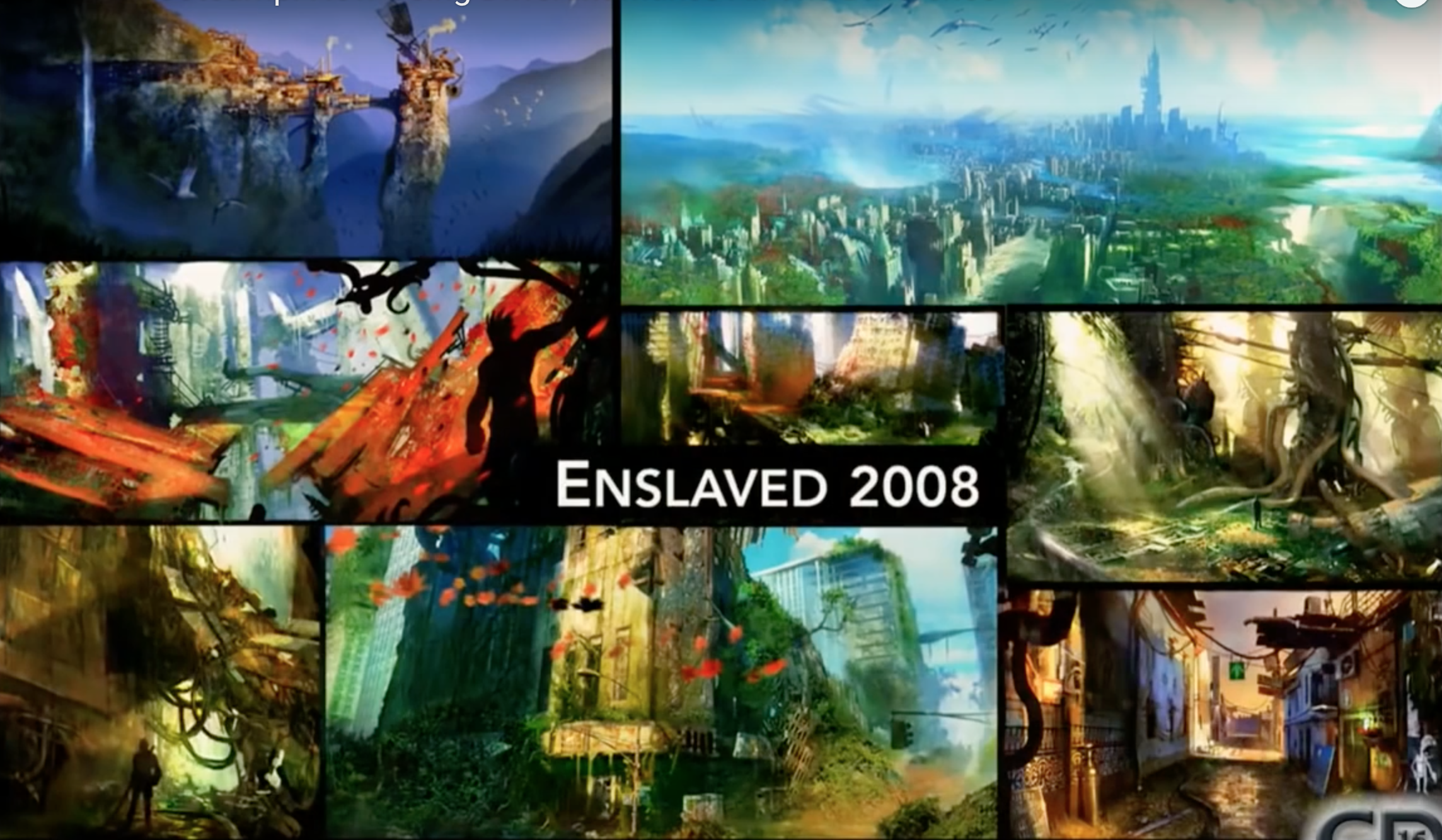
Check these slides from Ninja Theory’s Devil May Cry and Enslaved
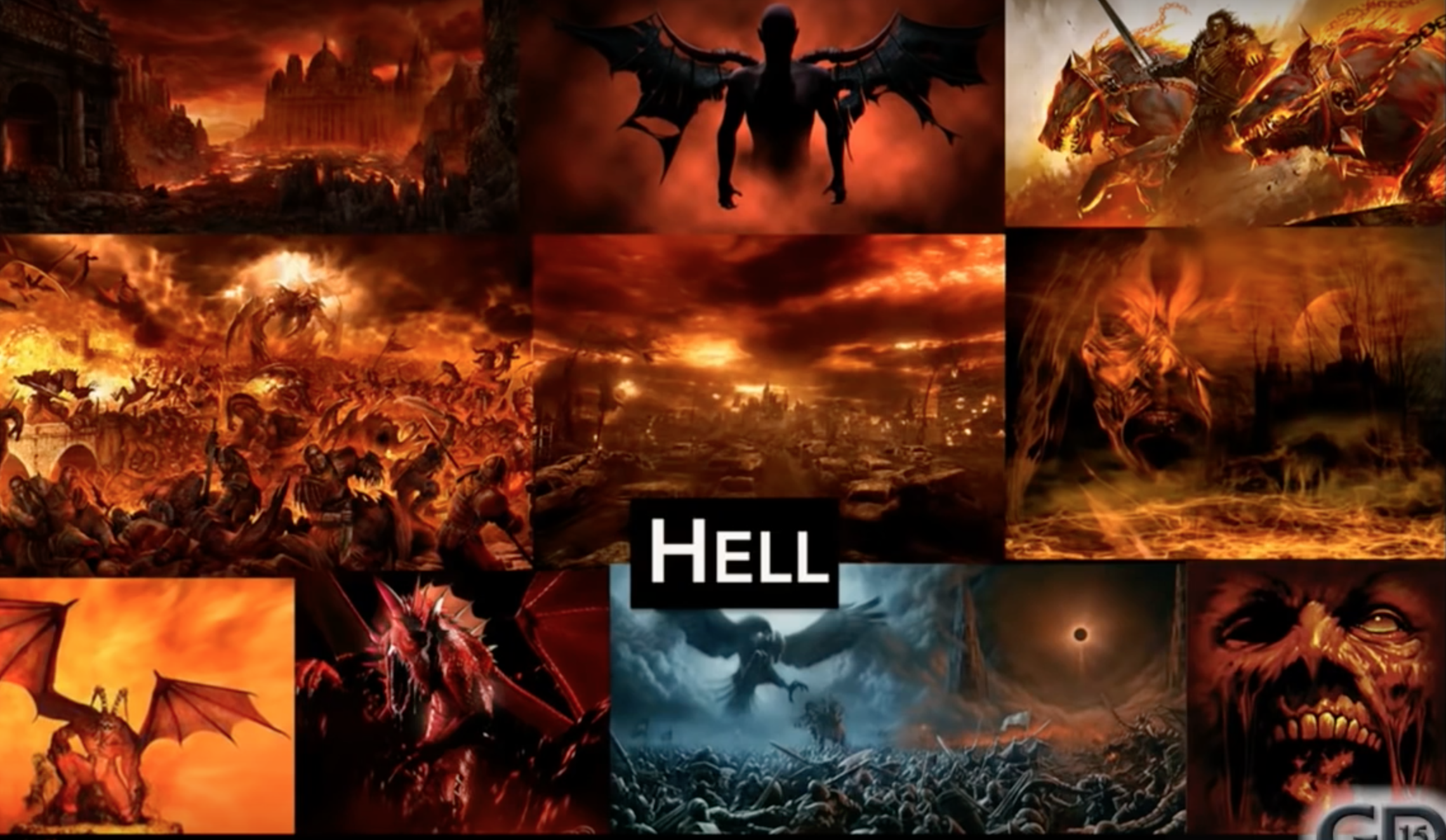
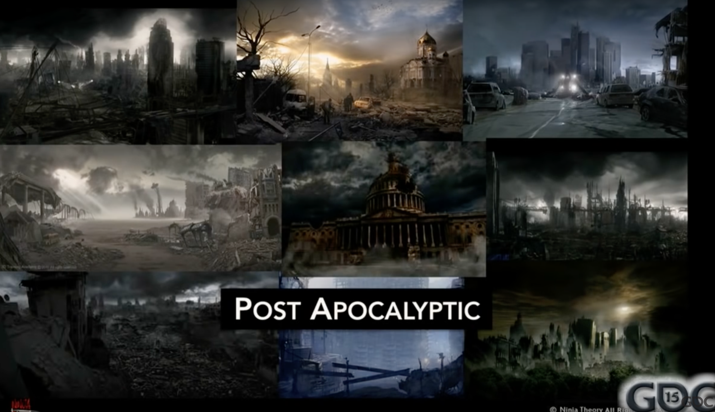
Two common scenarios and the reinterpretations by ninja theory.
Slides from this GDC talk (not that great, although their work is good)
Exercise:
Create a quick mood board on your miro focusing on the color palette (but also including visual motifs).
All the references must be outside of the realm of games.
If you don’t have any concrete starting points don’t jus image search “sad colors”. Try this site: same.energy
Add real world references to your mood board even if they don’t match the visual style and palette
Here you can look up things more literally things like “gothic church”, “salmon”, “CIA black site”.
This will inevitably force you to ask yourself questions like: where and when is this game taking place?
Challenge the tropes that emerge from the research
Readability
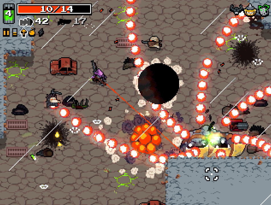
For arcade and action games, visual style is mostly functional to the communication of the game state.
In early arcade games characters are defined by what they can do, the visual capabilities and the actions they perform are limited.

What are some visual design decisions in Asteroids?
Gris – animation-first arty game. Special “mood abilities” expressed through shapes instead of UI.

![]() The proportions of the main character in Braid were dictated by the platforming gameplay. In cognitive terms, the player has less work to do to calculate the movements of a short squareish object.
The proportions of the main character in Braid were dictated by the platforming gameplay. In cognitive terms, the player has less work to do to calculate the movements of a short squareish object.
Silhouettes
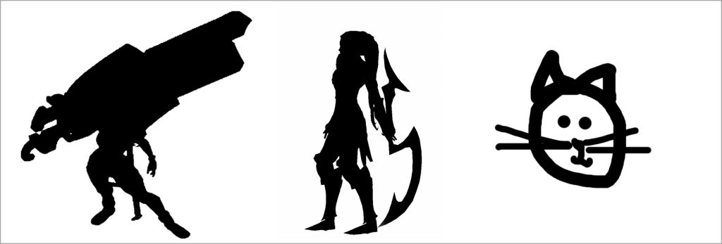 In arcade games and esports instantly recognizable silhouettes are a crucial aspect of readability.
Clarity in League of Legends

Don’t let the technology dictate your expressive modes

Background VS foreground
Action based 2d games must find consistent visual strategies to differentiate background and foreground, platforms, enemies and collectibles etc.
Let’s talk about your project’s readability challenges and how to address them.
Create a mock screenshot for your game. It should set the target in terms of production value and visual polish.
Base it on the art direction discussion you had today.
This delivery won’t likely involve the whole team. The other member should continue on the previous tasks.
Some pixelart examples – mock screenshots are more a pixelart thing – examples from twitter:
Game Juice
These talks are casual, a bit goofy and performative but they describe aspects of the game that can really make a difference: how the game provides a feedback, how to make every action feel satisfying, what are some simple strategies to make a game feel more alive and dynamic…
List the actions and events that require visual feedback
List the actions and events that could benefit from visual feedback
Create a priority list to inform your asset production schedule