
Where do these colors and ideas come from? Once again NON-GAME INSPIRATIONS
If you want to be a game artist, a graphic designer or an illustrator learn some color theory especially applied to the digital sphere.
For more complex/realistic illustrations like concept and background art it may make sense to paint in grayscale and colorize later.
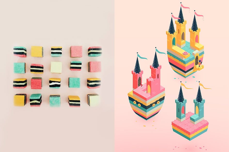
Mood board
Themes and scenarios come with more obvious tropes attached. If you create a mood board by just googling keyword you’ll get only visual cliches.
You can try to subvert some of the expectations, create your own twist and interpretations to a particular setting.
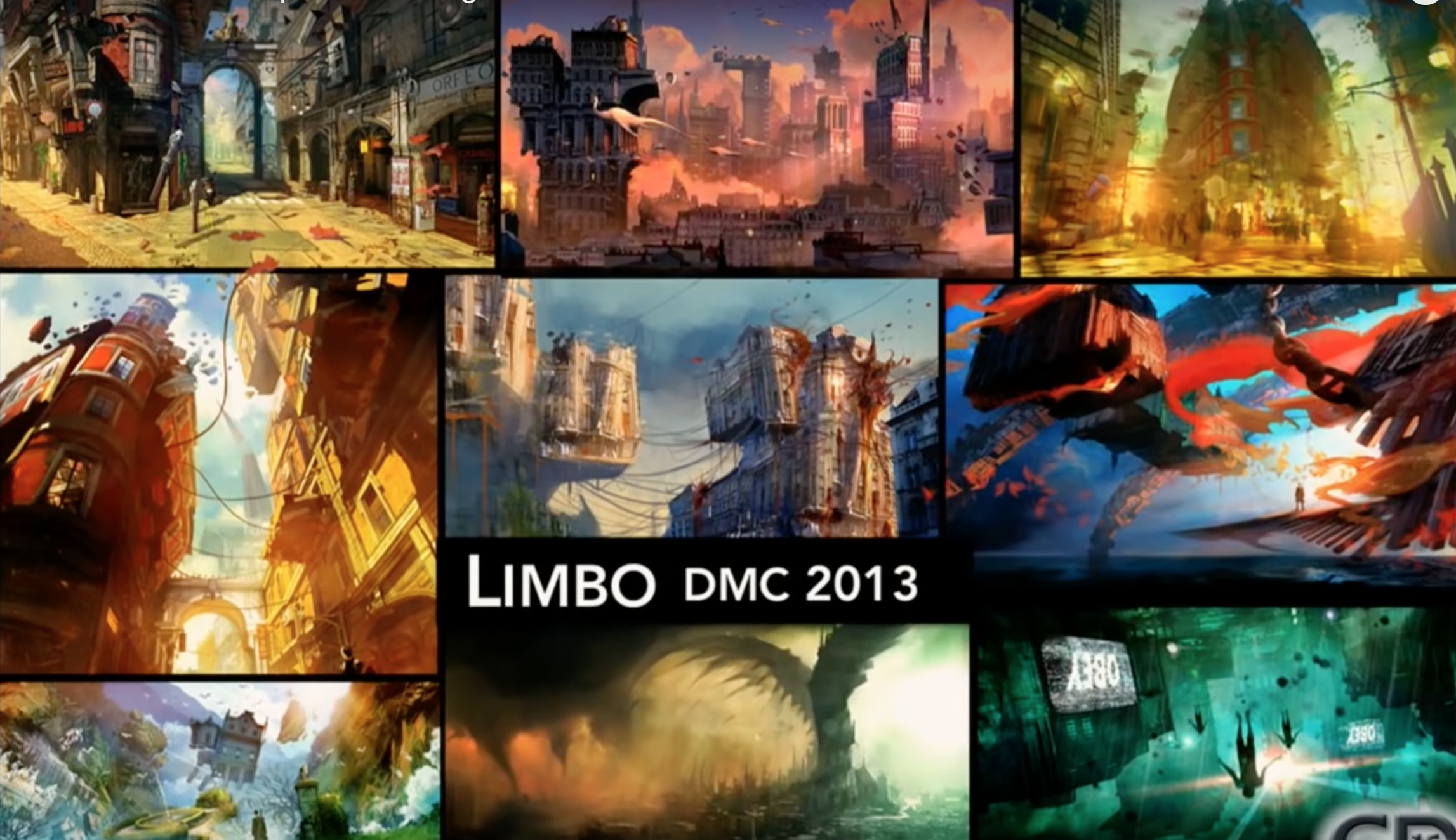
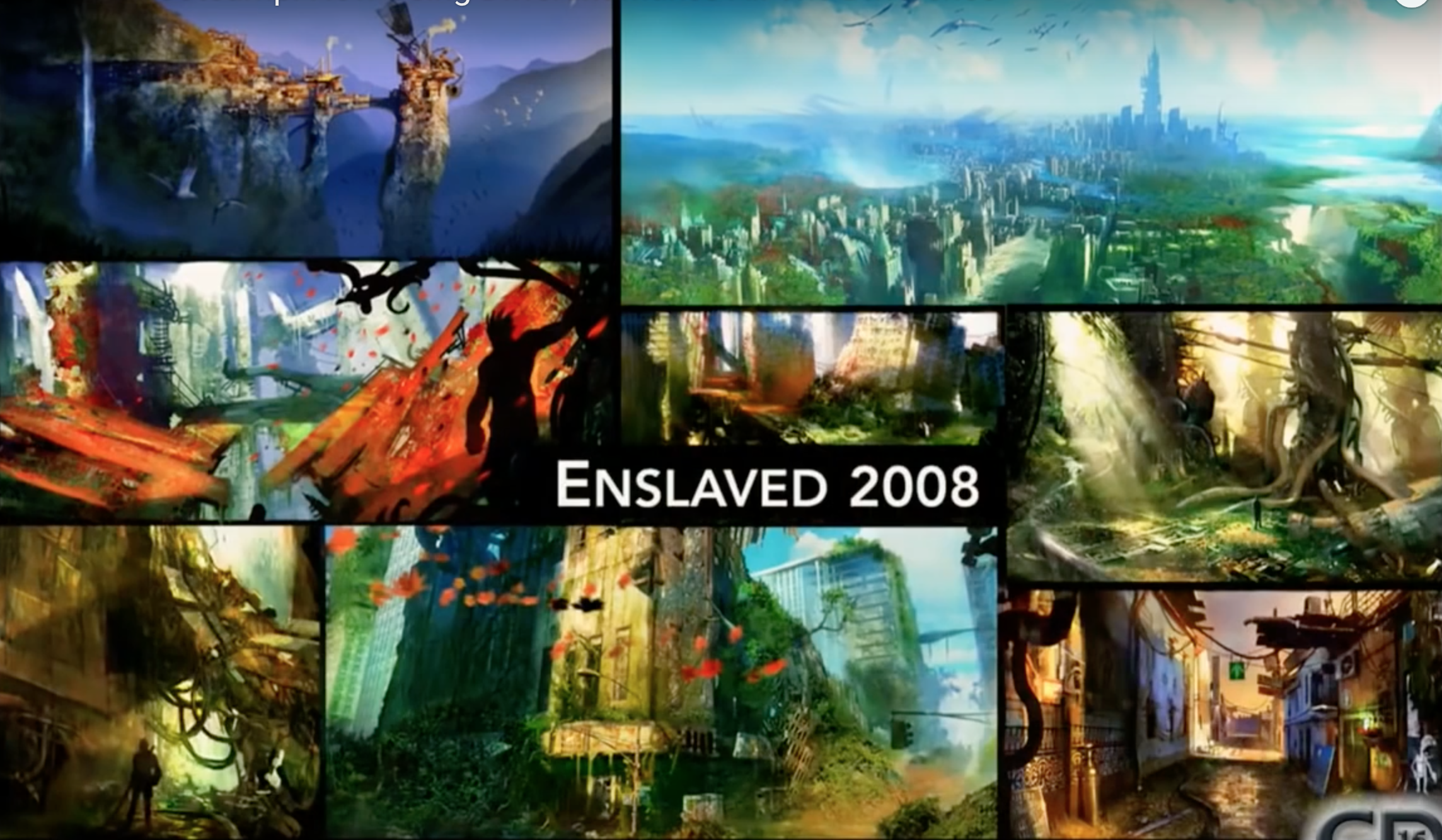
Check these slides from Ninja Theory’s Devil May Cry and Enslaved
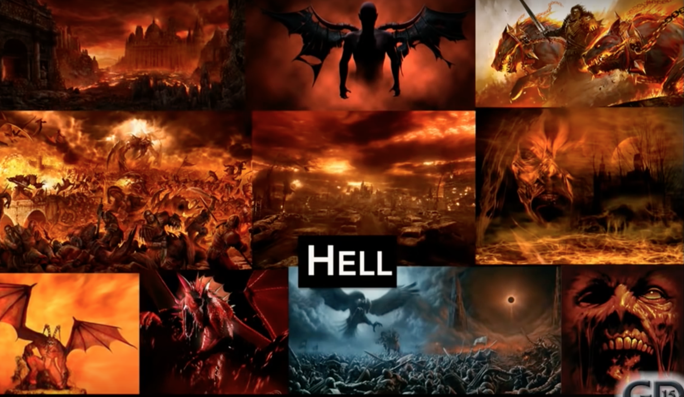
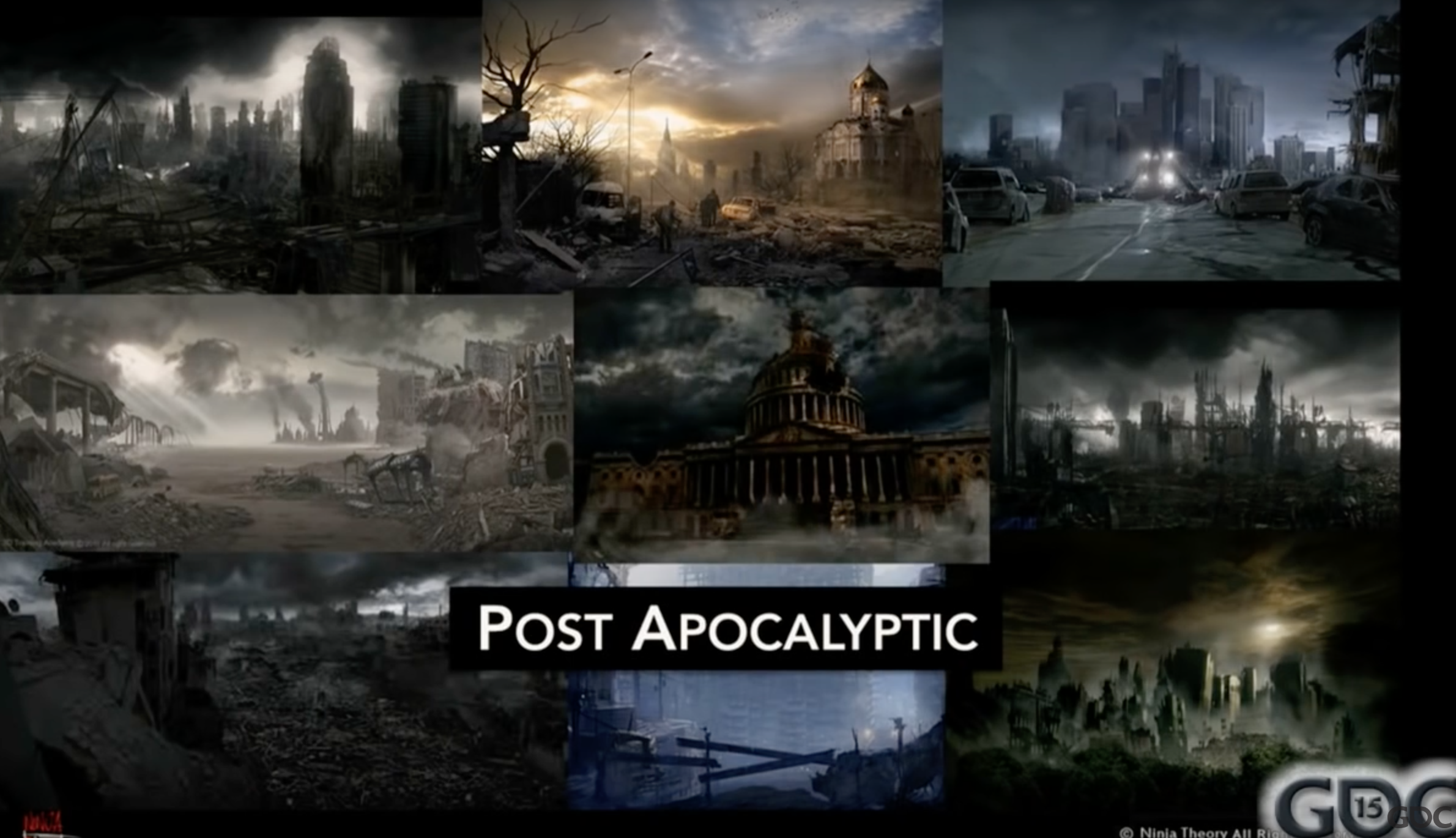
Two common scenarios and the reinterpretations by ninja theory.
Slides from this GDC talk (not that great, although their work is good)
Exercise:
Create a quick mood board on your miro focusing on the color palette (but also including visual motifs).
All the references must be outside of the realm of games.
If you don’t have any concrete starting points don’t jus image search “sad colors”. Try this site: same.energy
Add real world references to your mood board even if they don’t match the visual style and palette
Here you can look up things more literally things like “gothic church”, “salmon”, “CIA black site”.
This will inevitably force you to ask yourself questions like: where and when is this game taking place?
Challenge the tropes that emerge from the research
Readability
For arcade and action games, visual style is mostly functional to the communication of the game state.
In early arcade games characters are defined by what they can do, the visual capabilities and the actions they perform are limited.

What are some visual design decisions in Asteroids?
Gris – animation-first arty game. Special “mood abilities” expressed through shapes instead of UI.

![]() The proportions of the main character in Braid were dictated by the platforming gameplay. In cognitive terms, the player has less work to do to calculate the movements of a short squareish object.
The proportions of the main character in Braid were dictated by the platforming gameplay. In cognitive terms, the player has less work to do to calculate the movements of a short squareish object.
Silhouettes
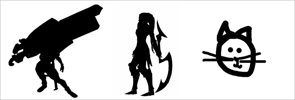 In arcade games and esports instantly recognizable silhouettes are a crucial aspect of readability.
Clarity in League of Legends

Don’t let the technology dictate your expressive modes

Background VS foreground
Action based 2d games must find consistent visual strategies to differentiate background and foreground, platforms, enemies and collectibles etc.
Let’s talk about your project’s readability challenges and how to address them.